Documenting Communities


My Evaluation.
In this task we had to take 6 photos inside and 6 photos outside. First i decided to take photos inside then i took photos outside. I choose the places where she sat and stood and where she looked. The photos i took outside look differently as i choose places with different natural lighting.
My favourite photo

In this task we had to choose are favourite photo we took. I chose this one because it has a plain background and natural lighting. To take this photo inside with natural lighting i sat her in-front of the black back drop by the window with the blind open.
The second step was to go on photos and turn it black and white. I really like this photo because it looks natural and makes it look like her clothes are blended in.

The third step was to take the black and white photo and put it on adobe photoshop. Once it was on photoshop we inverted the photo.
Homework


This is my community. The task was to take photographs of my community, i decided to take photos of my brother and his mate and my little cousin as they do not live with me.
|
|
I chose this short film because her photos are off her daughter and family. What i found interesting about this photograph was she takes photos to keep memories of her daughter as she has mental illness. I found that interesting because it shows that she cares and wants people to acknowledge her daughters illness. Sian approaches her photography project by taking photos of her daughter and family and friends to make memories that she don’t forget.
|
|
|
|
|
|
|
Documenting a single person


I took these photographs......

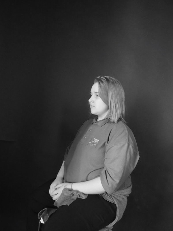
I choose this image because in this image it seems different to any other pictures i would take. This photograph is an image of a student in my photography class, when we was taking these photos she choose the way she wanted to stand, look and pose. I choose this angle because it has her whole body in the photograph and has a background. It makes it look like she is staring in front of her, it makes it look like she is taking a photo of the view.


These are the screenshots of the process during this lesson. I had to select my favourite image and put it in photoshop and edit it. I had to crop the original photo as there was a lot of space above the head. I changed it too black and white and changed the exposure to make it a bit darker and make it look like its got three different colours. I done another image before the last black and white and i changed the exposure to light.
Tyler Mitchell

In this photograph i can see a young man under water with a plastic bag over his head that is filed with water up to his eyes. This gives a sense of emptiness and also fright however you also get a feeling where he is okay because he has goggles and snorkel on to help him breathe. The goggle and snorkel are recognisable because when you go to the sea you see people using them to go scuba diving or little kids also use them so they can see and breathe when they’re under water.
This photo reminds me of someone feeling alone and empty and also claustrophobic because he is by his self in a closed place where he can not move anywhere. It’s like he is empty because he is alone in his own mind space and could be feeling really down and depressed. This photo is different from real life because you wouldn’t normally see someone swimming with a plastic bag on their head as it could kill them or suffocate them. However the way the photographer has taken this photo it did not kill or suffocate the boy. This photo is interesting in my opinion because it is different from other photographers i have looked at
This photo reminds me of someone feeling alone and empty and also claustrophobic because he is by his self in a closed place where he can not move anywhere. It’s like he is empty because he is alone in his own mind space and could be feeling really down and depressed. This photo is different from real life because you wouldn’t normally see someone swimming with a plastic bag on their head as it could kill them or suffocate them. However the way the photographer has taken this photo it did not kill or suffocate the boy. This photo is interesting in my opinion because it is different from other photographers i have looked at


In this task we had to take photos inspired by Tyler Mitchell’s photographers we had a look at. I thought it was a good idea to take photographs in the art apartment as they is many bright colours in Tyler’s photos. The main thing we need to focus on was the colours, lighting and also shapes. I used the lighting outside as it was bright and sunny it was a good day for these photos and used shapes outside and inside. I used shapes outside as the light was bright so i could use our shadows as the shapes. Inside i used shapes in the art apartment with all the props they have.
Interesting composition
black people leisure
engaged in audacity
non stereotypical
colour
fashion
props
greenery
plain vibrant colours
black people leisure
engaged in audacity
non stereotypical
colour
fashion
props
greenery
plain vibrant colours


In this task we had to take 12 photos inspired by Tyler Mitchells. These photos had to be close ups of the torso and head or you could have full body but it had to have nature in the background, they all needed to have bright colours and had to be original. I think they very colourful and original, this is more of an unrealistic photo because you don’t normally get people outside with a mirror behind them and sheet covering them. In these photos i took me and my partner used two different types of sheets to make it more colourful, we used a big square mirror for the reflection as well. This is a good idea to use a mirror because you use it for the reflection but you could also see the back off her, it also makes it bright and give more colours.
Nick Meyer- The local
|
|
These are photos of Nick Meyer's work, i think they are all from one area called the local. I think this shows he lives in a normal place however if you look closely you can see the town is originality. The picture where the brush is hanging makes it look like it is alive and has crouched down like it is sad. These pictures go together in a weird way because they are all different sort off styles. Two of them contain nature and three represents life.
|


Collage
Todays Task
- Review your images from all of your photoshoots and start selecting images.
- The images that you select do not have to be the most successful images.
- Think about grouping photographs that are from the same area or are of the same theme., changing them around
- Group your images together on your website to see how they look together.
- If you want the images from your extended project as your final piece that would be ok too.
- Print your images and have a look at them as a sequence of images.
- Try different combinations of the images.
- You can print the images in different sizes like the images above.
- Some of the images may be printed onto different types of paper.
- You may want to consider printing images singly and mounting them as protest boards as above.


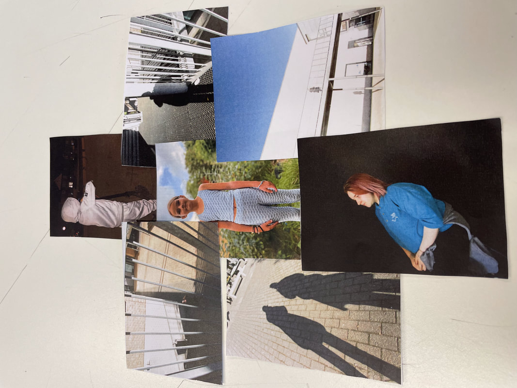
These are different styles i tried, i got these sort of ideas from Pinterest and the internet. I thought these were interesting ways to collage my photos as you can see all the photos but it looks like they is way more photos as there are all on top each other which makes it look a lot more than it is. I think these colleges are all creative and original.
This is my favourite college that i created


I choose these photos because some of them are inspired by Nick Meyer, Tyler Mitchell’s and some of them also involve my community. These photos were chosen as they show our community and in my opinion i think these photos will inspire others, this is because of the bright colours, the angles and also shows our living. In these photos i think the colours bring them out the most as colour will always bring out the best in photos.


I have choose 6 different Pinterest display strategies, I choose these 6 main screenshots as i find these very interesting this is because all the photographs are so close to each other and on top off each other. These photographs interest me as they are very bright and stand out, all the photos look similar to each other and i think that what makes it so interesting and suitable.


These are the photos i have took for my last lesson of Documenting Communities. These photos are practice once i have picked my favourite collage i will get a big piece of card paper and print the photos of on to the card to make my final piece. I think it will to out alright, i am not to sure as i feel like they is not enough of my community, but on the other hand i feel quite happy about how this will turn out.


This is the next step to my final piece, i am going to take some of my photos and turn them into black and white than take them into the dark room. I think this will add an affective frame in my collage, it will also make it stand out a bit more.


These are the two photos i have turned black and white, i thought these would be better to be in black and white as they were the two biggest ones and would stand out more. The next step after this is to invert the black and white photos on photoshop.


This is the college with the two black and white photos, i changed two photos black and white because i thought it would add a stronger colour and make the smaller photos stand out. I’m thinking about printing the top right photo in black and white as well. I think this is a good idea because then it matches the other big photos. For me i think the black and white makes the main subject in the photo stand out.


I decided to make the other photo black and white, i think this was a good idea as before when they was only two black and whites i wasn’t to sure how i felt about it. I changed my mind and chose to do another photo black and white because then all the bigger photos will be the same, i took these pictures as it represents my community and the people that share memories with me. For example i got pictures of both of my siblings, my brother and sister. The pictures i took off my siblings were outside and this was because it where we have the most joy and where everyone is at they happiest. The pictures of my friends represent my community in school, it also presents the way i see the school in away this is because its the place of my education and where my friends are and this shows to me that i can improve on a lot. This is not my final piece though as i wanted to change it a few more times to see what else i could do to improve for my final piece.


This is another step to my final project, i changed my piece again as before they was more pictures with loads of colours and i decided to take the colour pictures out and have my collage representing my community with my family and the way i see school instead of having my friends in the college. This is because my community is where i stay and where i am comfortable in myself and also the people around me. This shows in away that i am more myself outside of school then inside.
Final piece
Statement
Final Evaluation
This is my final piece,
Nick Meyer


I think these images reflect on an area near a lot of nature, they give off a sort of feeling like everything is beautiful but dull. These images make me feel like this because they are set in like the woods and near forests and it gives off that sort of vibe because they is beautiful flowers and tress just placed and it makes it give off a colourful but dull pieces. These images in my opinion do go together and form a sequence off images because they all placed in similar places except the photo book and the flowers on the car but i added them two as well because they give off a sort of beautiful nature vibe and they seem to make the other photos sink together. I think these images represent that someone is in a dark place but then the nature is they safe place and the place they can turn to when they day has gone bad. I think these images say that
Zoe Leonard
|
|
|


I choose these images because they have similar colours and they all have houses above them and they all look like they are in a quiet place. These images all have differences for example, they do not sell the same thing, some of them look more posh and fancier than the others and they are different sizes. The colour of the shop fronts are usually way more brighter and have way more details but with these shops they are quiet dull and less details.
My Shopfronts


cut out


Collage


My finish product


Evaluation of Documenting Communities
I have done many different analysis through out the year,
